Selected Work / Case Study
Tabiya
Client Sector
Australian executive coaching and consultancy firm (strategy, leadership, advisory services)
APPROACH
Competitive audit, IA restructure, restrained identity system
Timeline
2025 - 4 Weeks
Business Metric
Full client adoption: every recommendation shipped
Role
Product/UX designer leading website experience redesign and cohesive visual identity
01 / THE STAKES
Building credibility
Tabiya's entire pipeline runs on trust: an executive coaching practice wins clients through referral and reputation, and its website was actively undermining both. No value proposition, buried services, and inconsistent branding meant that for a firm whose competitors were professionalising fast, every visit that ended in doubt was a consultation that never got booked. Success was defined as a site that behaves like a trusted referral: a visitor understands who the firm serves within the first scroll and reaches a booking without interpretive work.
02 / The Structural Conflict
Why wasn't the website converting?
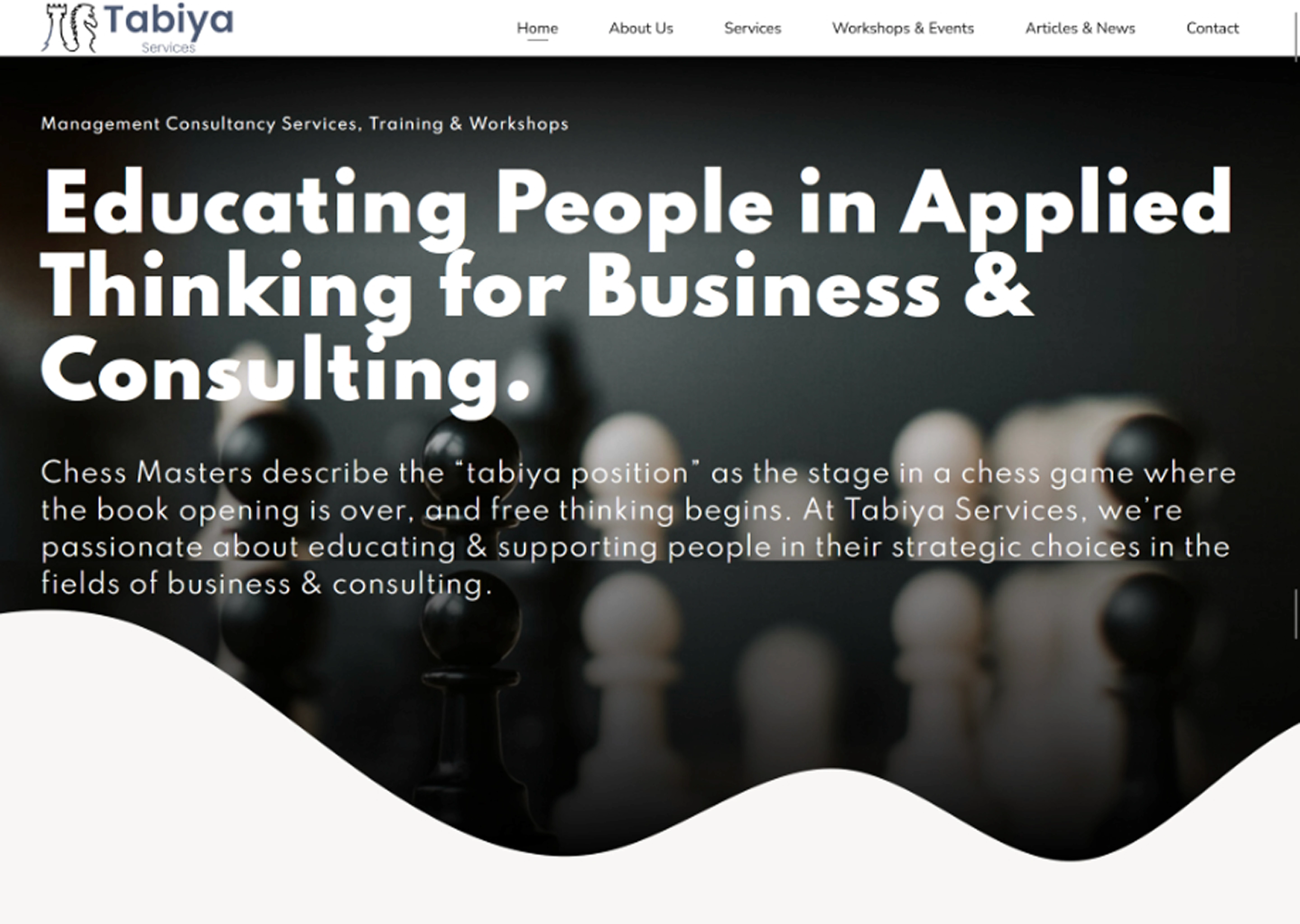
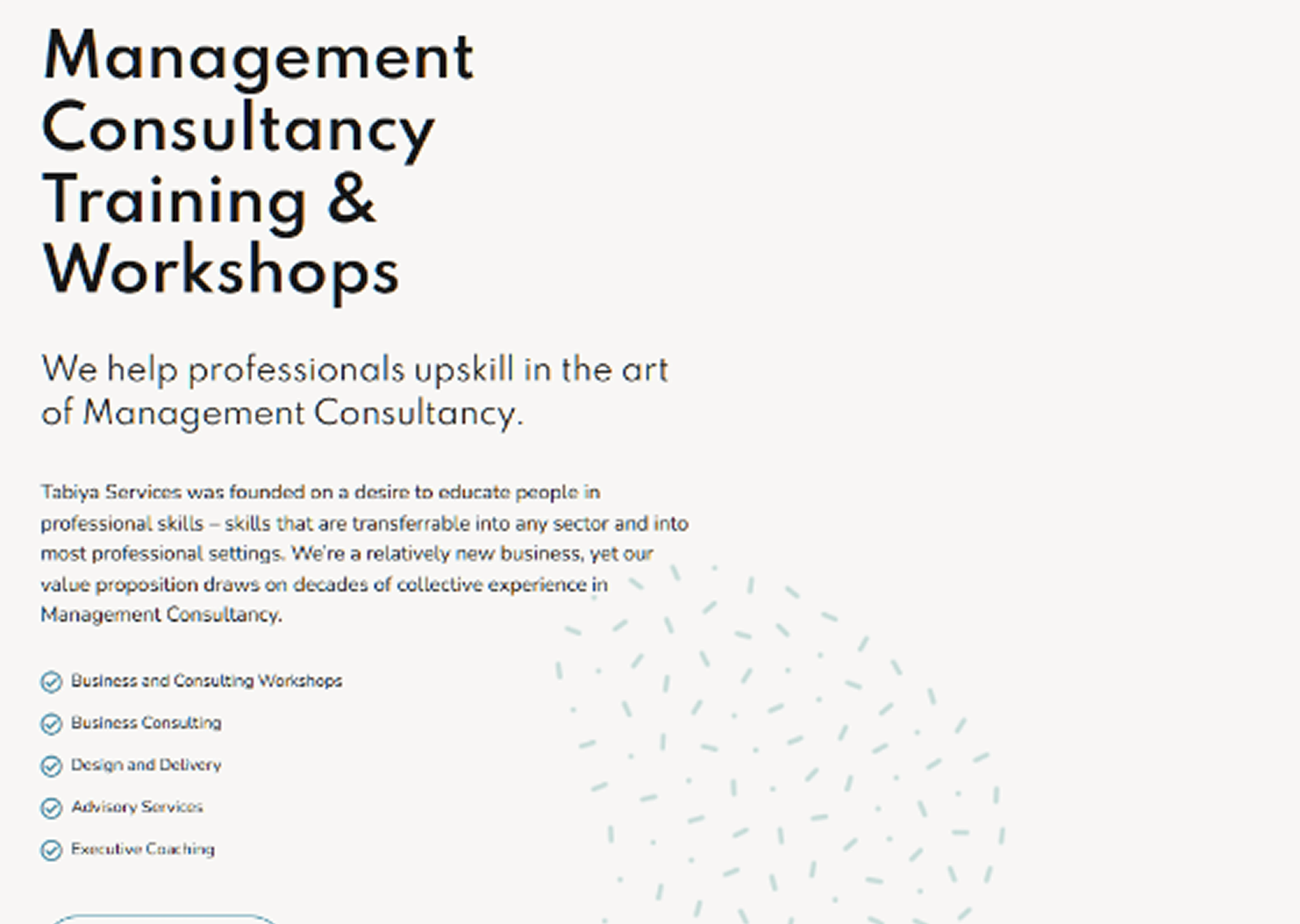
The homepage carried no hero-level value proposition, leaving visitors without an immediate answer to "is this firm right for me?" Five core services (executive coaching, group mentoring, workshop-based learning, business consulting, advisory) were buried below the fold as a single undifferentiated block with no dedicated pages or calls to action. Body copy was left-aligned and text-heavy with no multi-column structure, and inconsistent branding undermined trust for a firm built entirely on reputation. No conversion moments existed anywhere in the flow.
“I’d have to scroll to the very bottom to see executive coaching; and I’d assume that’s not for me, because I’m not an executive.” - Client interview
Design response: five services split into dedicated pages, each specifically named and plainly described, replacing one long undifferentiated list.
03 / Heuristic Tactics
Designing against the clock
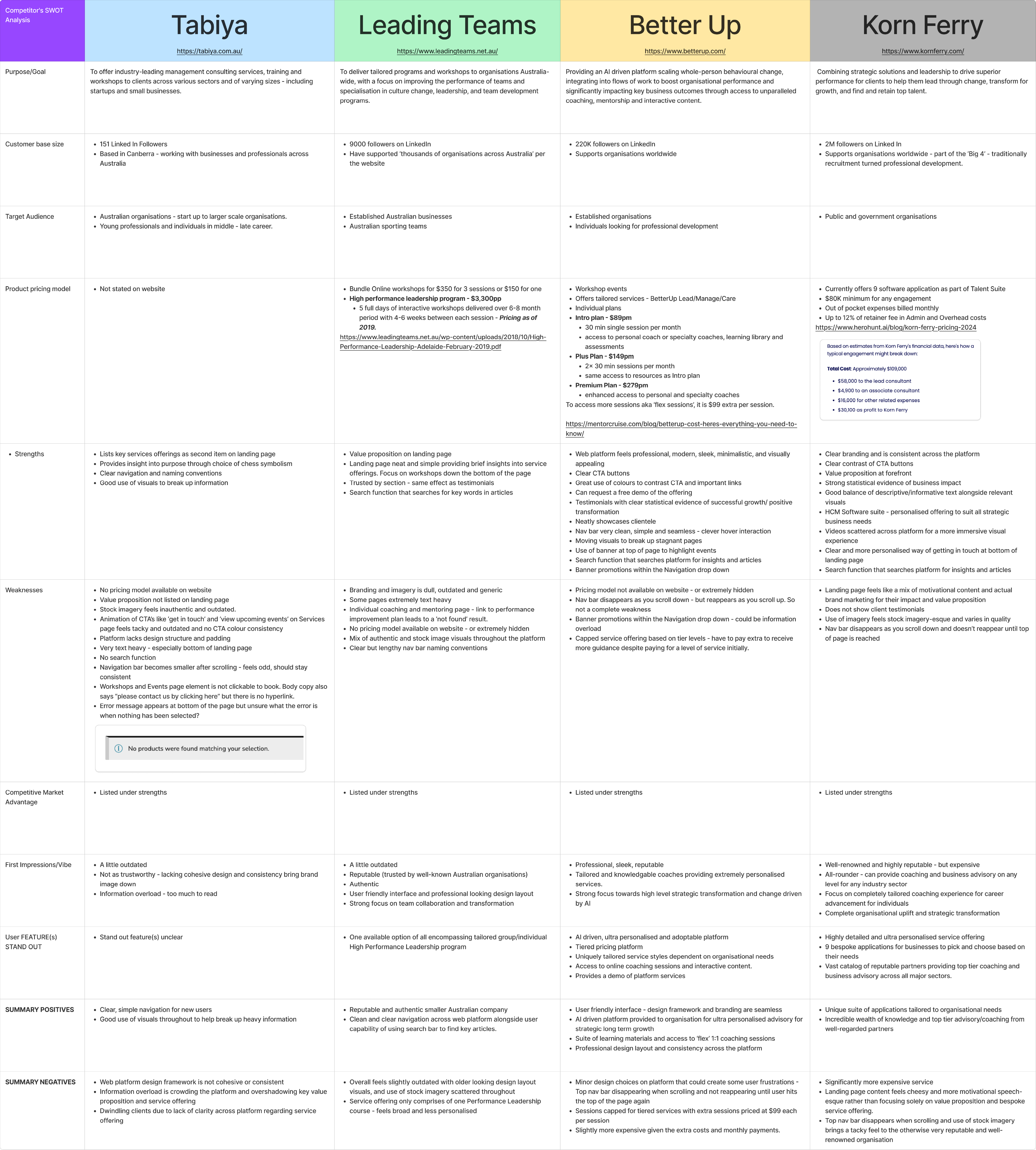
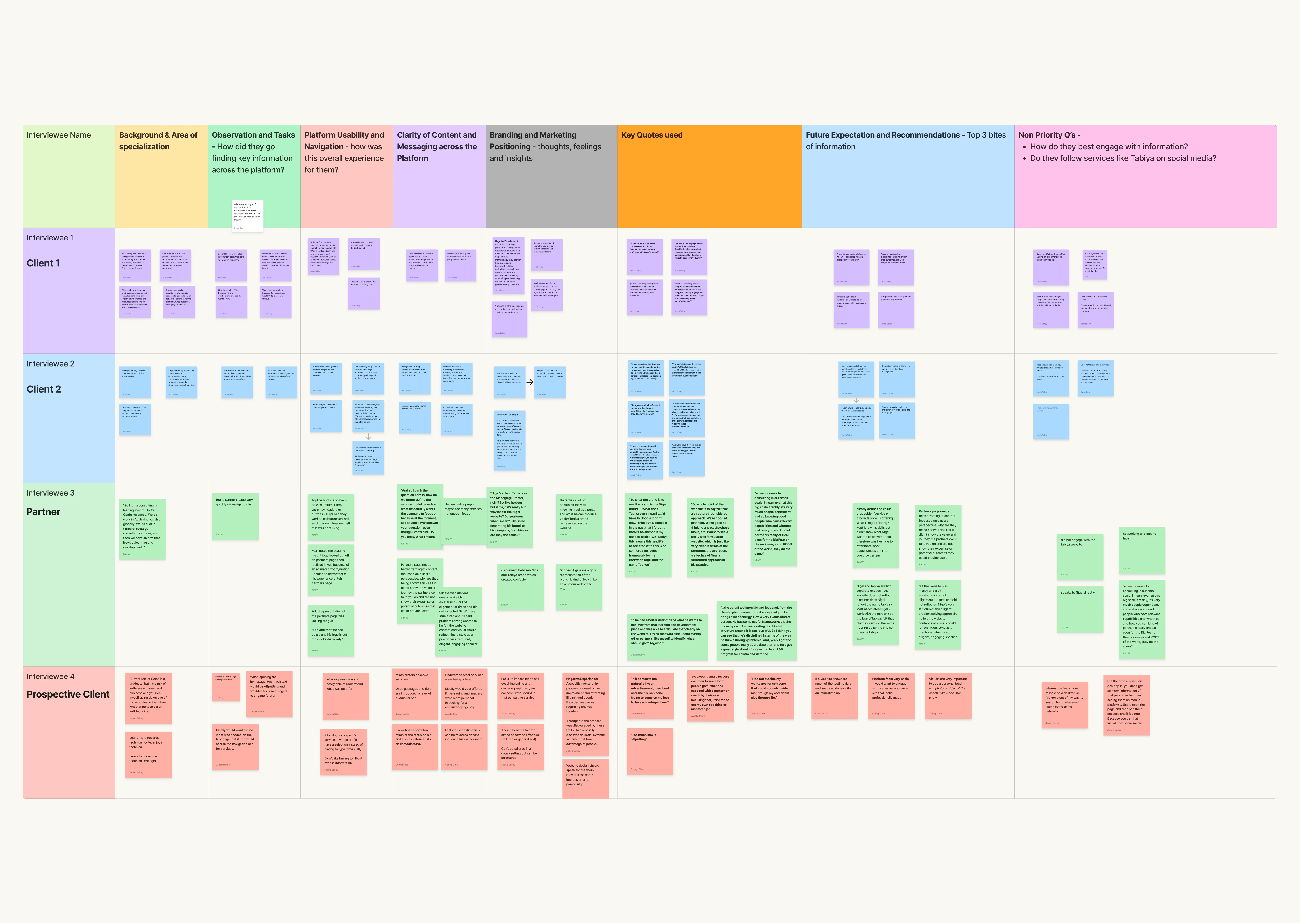
A competitive audit against firms including Leading Teams and Spectra Training benchmarked how high-trust service firms communicate credibility, revealing a consistent pattern of clear hero value propositions, structured navigation, and restrained visual identity. A heuristic evaluation of the existing site focused on two areas: first impressions (what a client absorbs before scrolling) and service discoverability (how easily a visitor identifies offerings and how to engage). User interviews surfaced recurring hesitations, and affinity mapping clustered findings into focused problem areas to direct the sprint.
“If people say that they do everything, I don’t believe that they do everything well. When there’s a long list of different services people offer, I tend to assume that they don’t do any of it well.” - Client interview
Design response: a hero that leads with a direct statement of what Tabiya offers and who it serves, so a visitor never has to scroll to learn whether they belong.
04 / DECISIONS & TRADE-OFFS
What we aimed to uncover
Four weeks and no analytics baseline meant decisions leaned on benchmark evidence rather than usage data, a stated assumption rather than a hidden one. The competitive audit against firms like Leading Teams set the credibility bar and kept the sprint focused on structure over decoration: information architecture and identity first, feature ideas parked. The trade-off was deliberate, a restrained system a small practice could ship and maintain beat an ambitious one it could not.

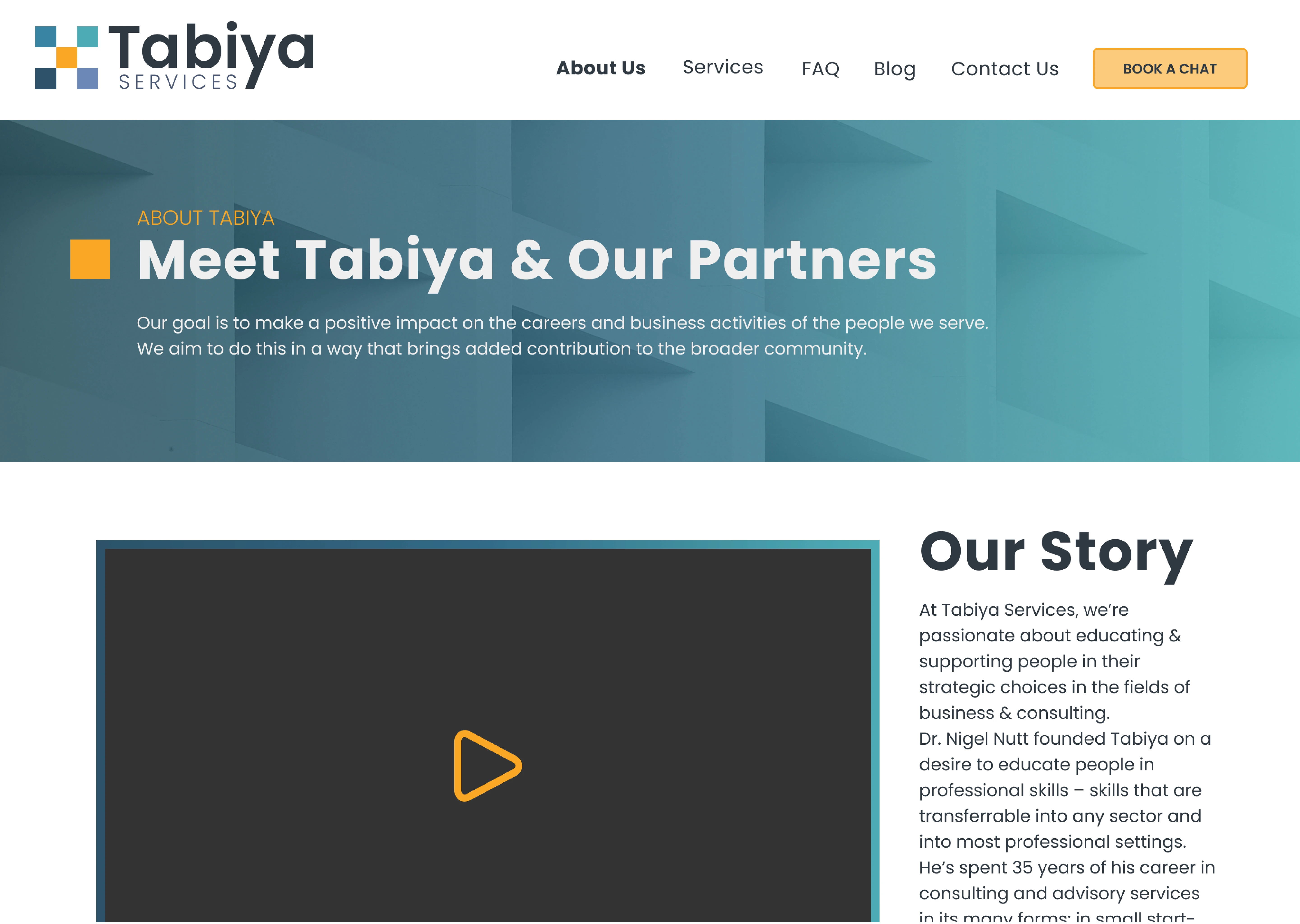
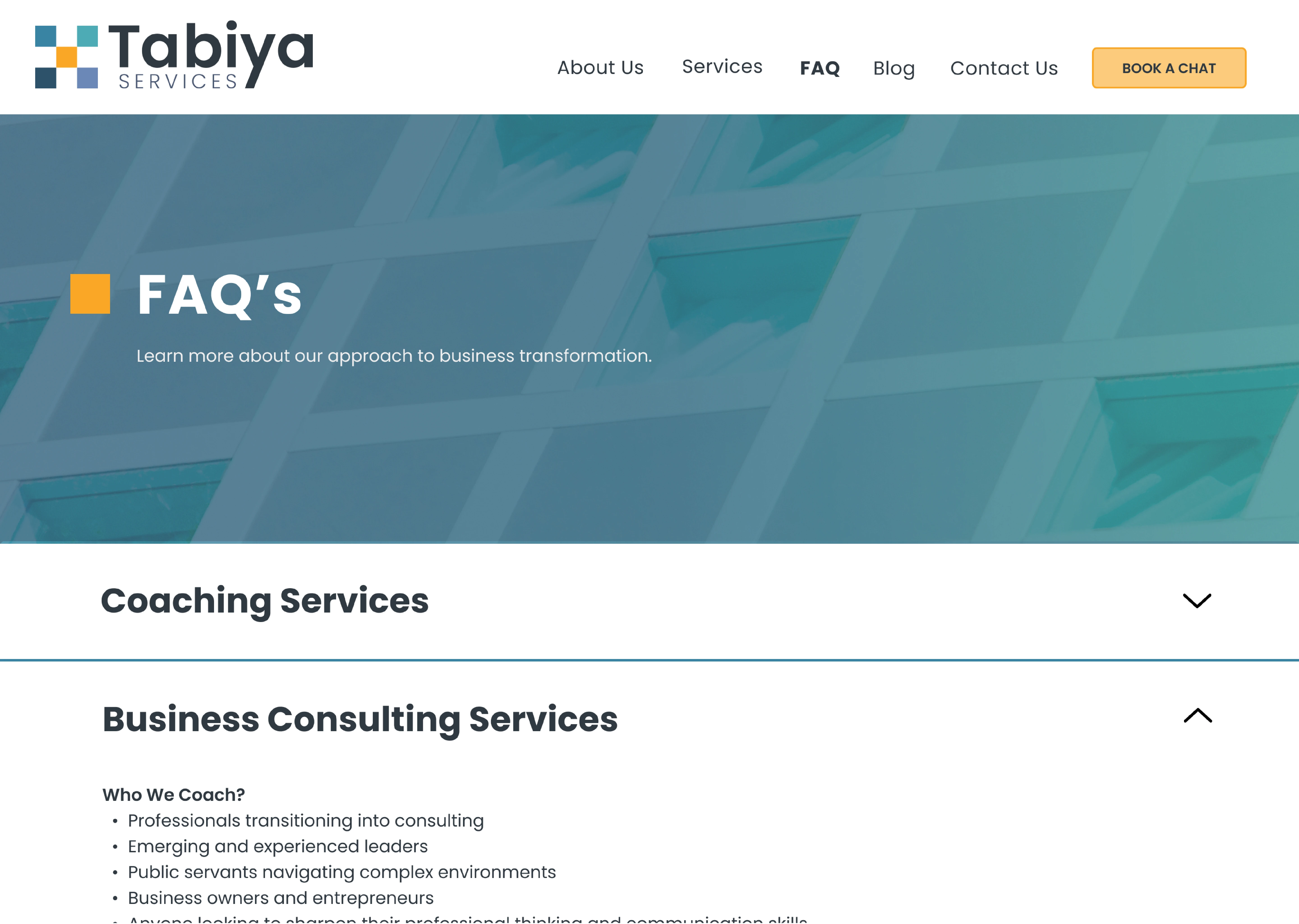
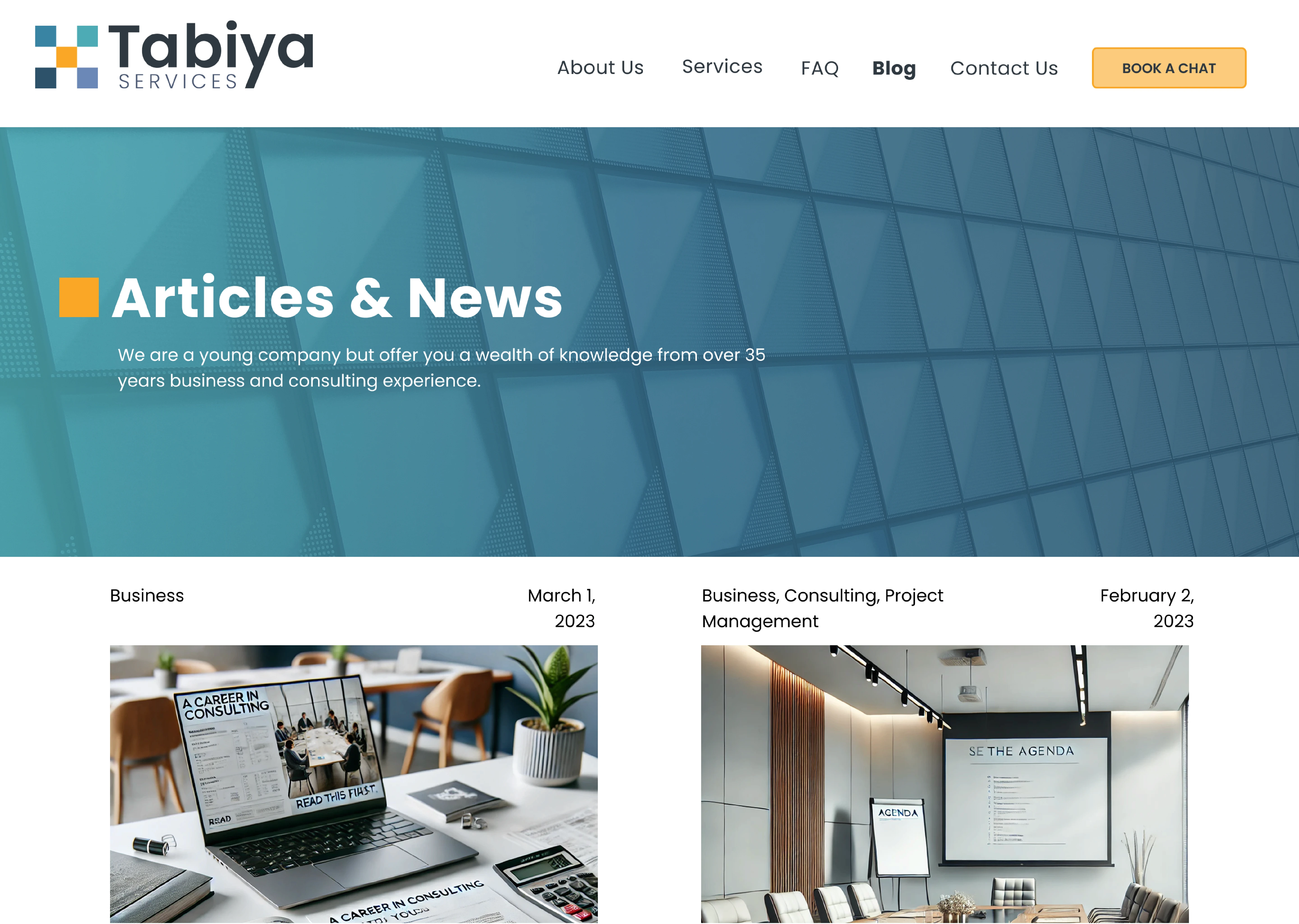
Interviews showed visitors couldn’t tell what Tabiya offered or whether it was for them. My design response gave each of the five services its own page (About, FAQ, and Blog included), so the structure itself answers “is this for me?” before any reading.
The old site buried its services in a single block below the fold. My design response surfaced them as distinct, plainly-named destinations a visitor could scan in seconds.
05 / The Architectural Resolution
Credibility before a single word is read
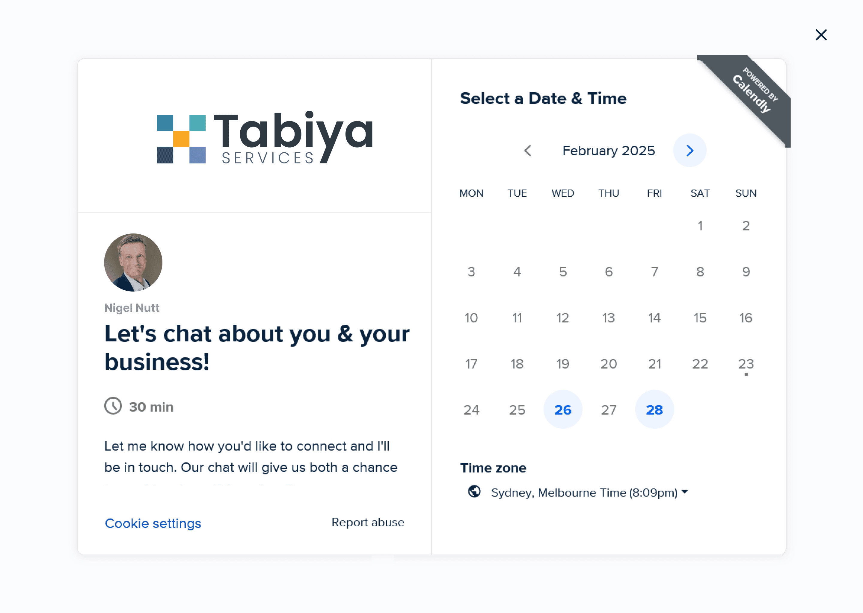
The hero was restructured to lead with a direct statement of what Tabiya offers and who it serves, becoming the site's first credibility signal. Each of the five services was given its own presence with clear descriptions and dedicated calls to action, replacing the undifferentiated block. A restrained visual system grounded in white space, typographic hierarchy, and consistent colour application replaced the previous inconsistency with a unified presence. Conversion moments were placed at natural decision points so visitors at any stage had a frictionless path to booking a consultation.
“I know Nigel. I don’t really know the Tabiya brand.” - Partner interview
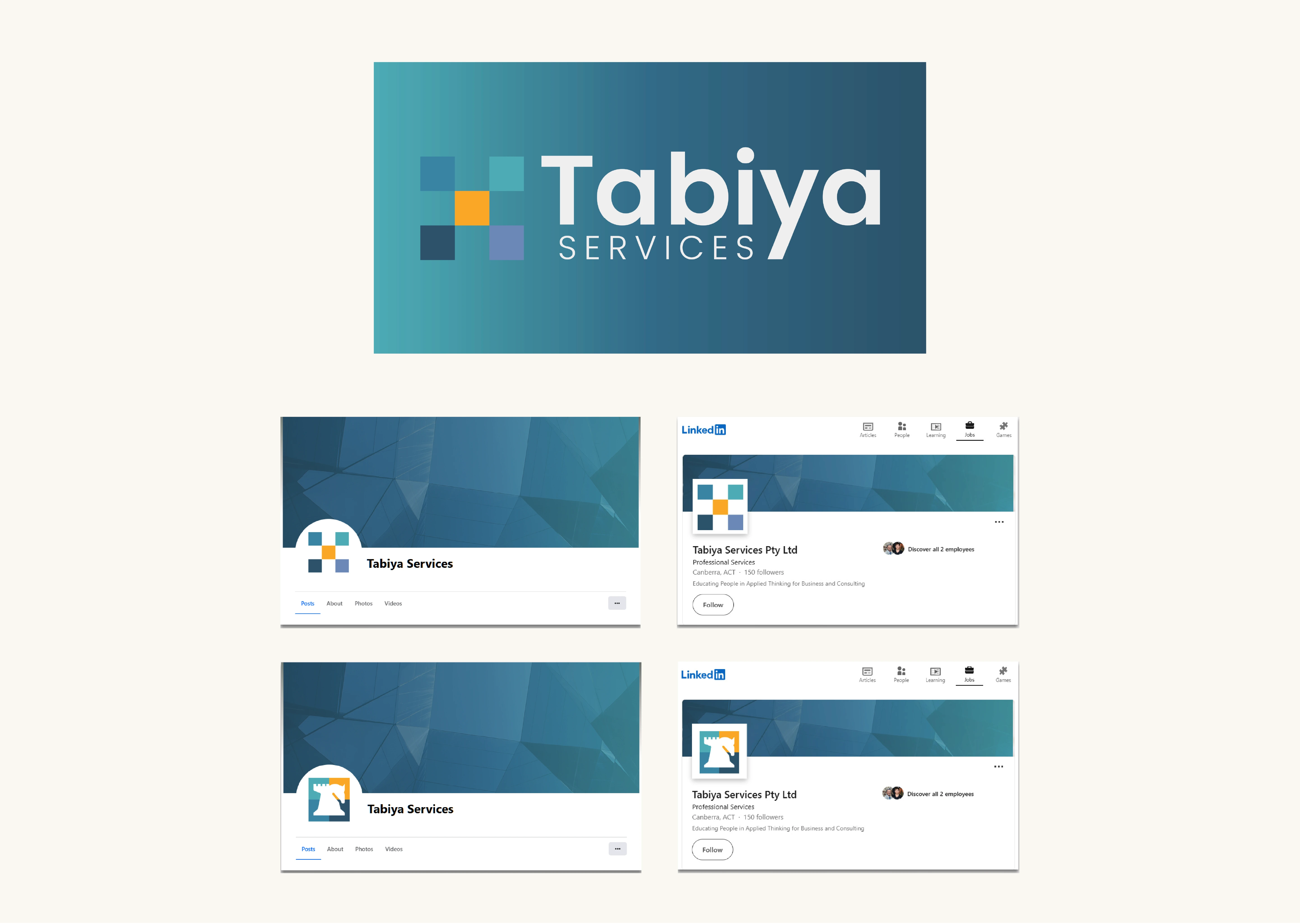
Design response: a restrained identity system of white space, typographic hierarchy, and consistent colour, so the brand carries its own presence rather than resting on one person’s reputation.
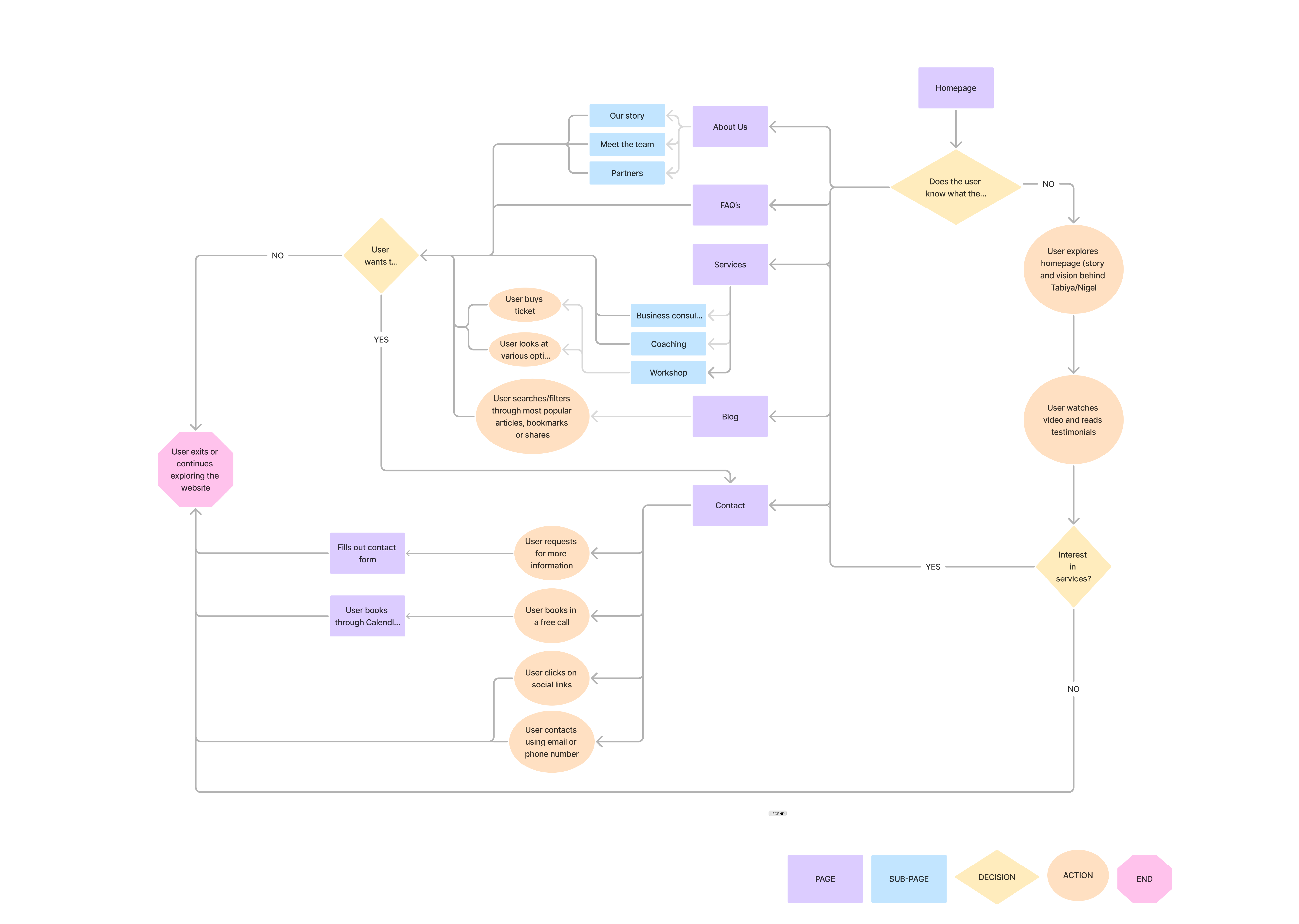
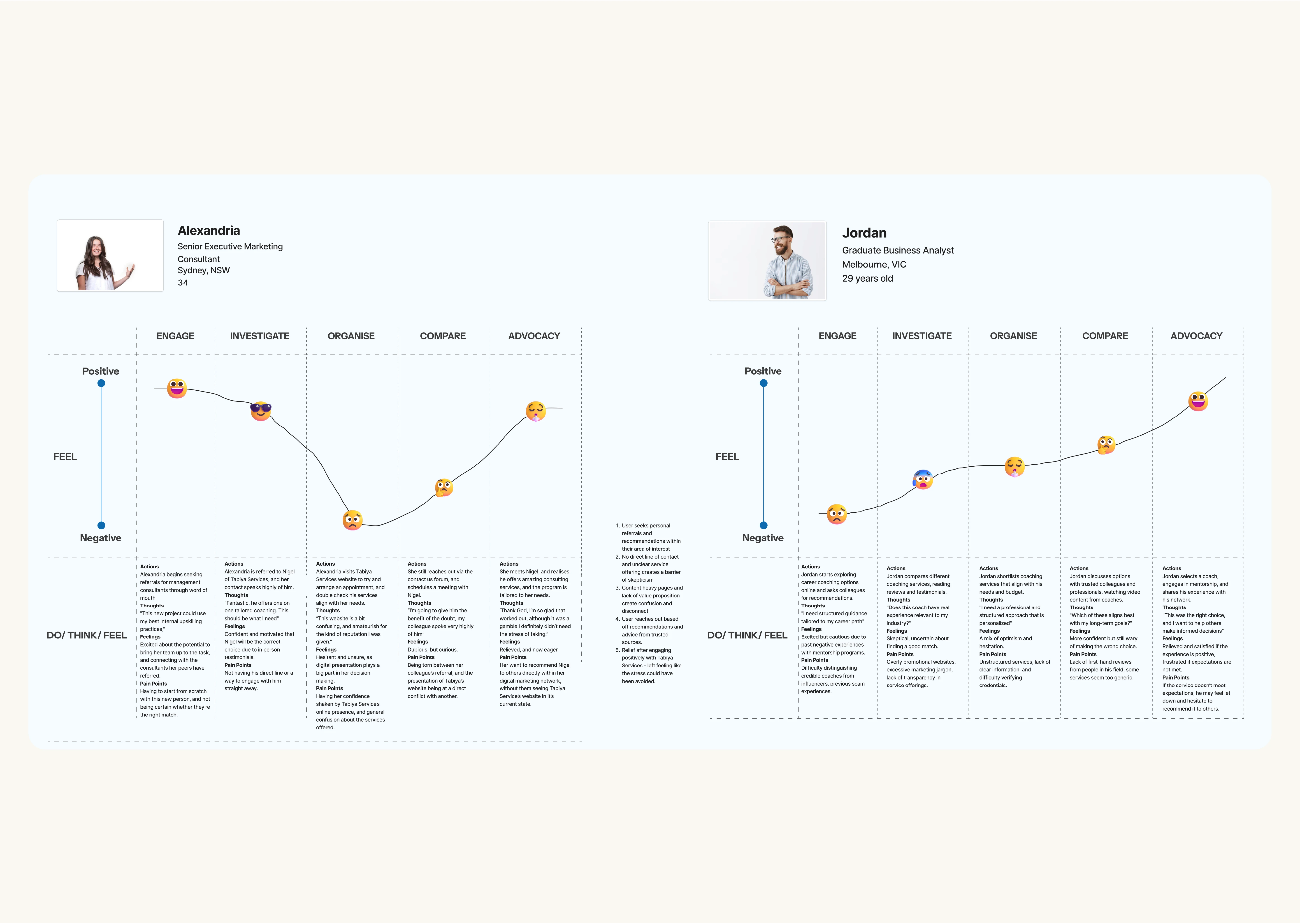
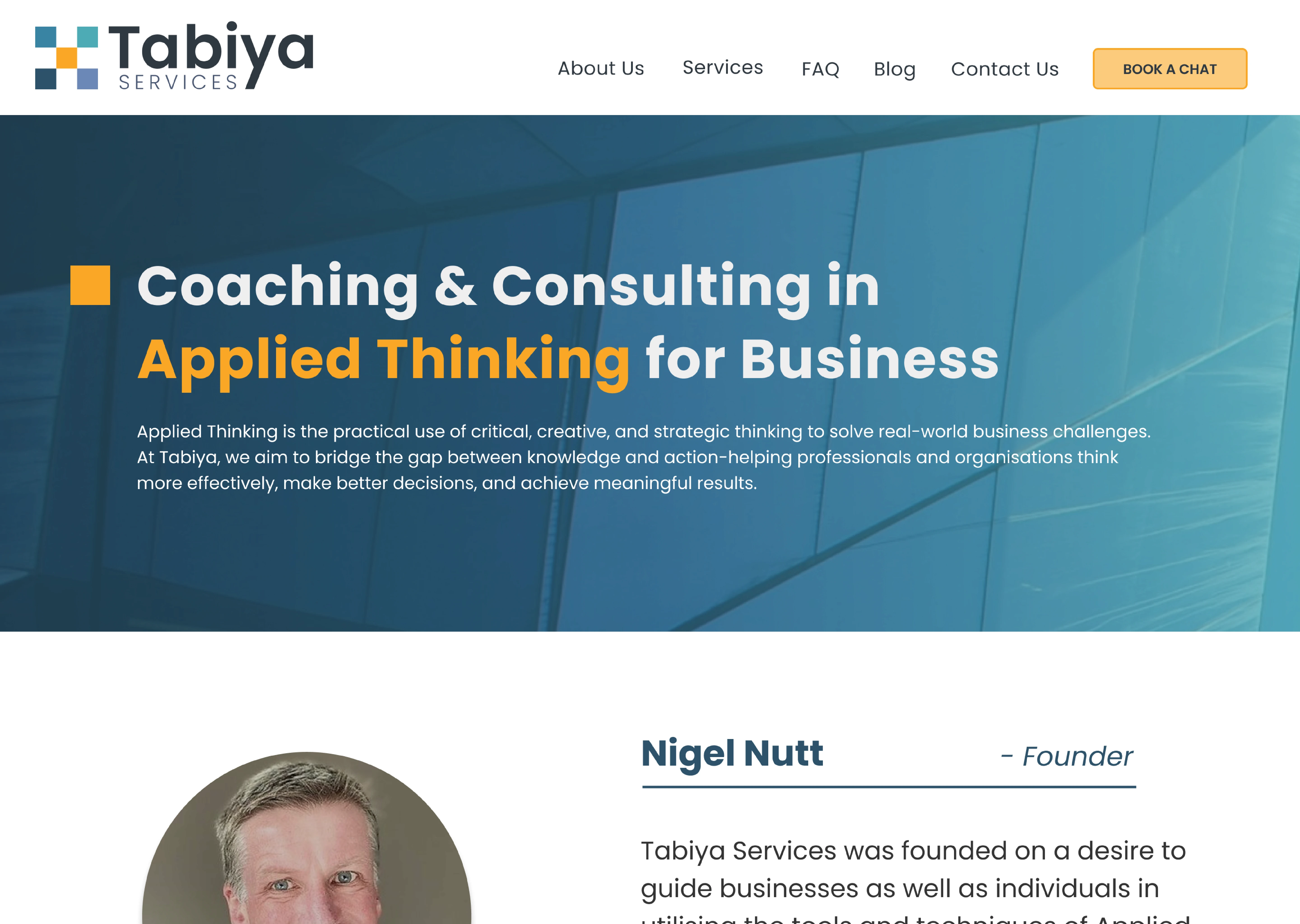
Research traced the drop-off to structure, not styling: no clear path from landing to booking. My design response mapped the flow (hero, service, understanding, booking) so every step has an obvious next move.
A partner told us the site felt hard to trust. My design response placed a booking moment at each natural decision point, so intent never outruns the path to act on it.
06 / PROJECTED IMPACT
What was accomplished
The clearest outcome was adoption: every design and brand recommendation was actioned without exception, and the site relaunched with the restructured IA, dedicated service pages, and refreshed identity. As a pre-launch sprint no baseline metrics existed, so the measurement plan defines success going forward: consultation enquiries booked, service-page depth per visit, and drop-off before the first scroll of the hero.
07 / Key Learnings
Restraint as a design decision
Credibility is structural before it is visual. The most damaging issues were architectural, not aesthetic: no value proposition and no navigable service structure. Information architecture is always the first design problem to solve.
Competitive context sets the standard. Benchmarking against high-trust firms made the credibility gap concrete and defensible, and let the team prioritise what comparable firms do consistently.
Restraint is a design decision. For a professional services firm, the absence of noise is itself a credibility signal. Choosing what not to include required as much deliberate thinking as anything added.